
From: https://towardsdatascience.com/embed-interactive-plots-in-your-slides-with-plotly-fde92a5865a
Effective communication is essential for us data scientists, and Plotly’s interactive plots are a great tool for that. But when it comes to presenting our work in a traditional slide-styled presentation, those plots are hard to integrate in our daily tools like PowerPoint or Google Slides. In this post, we’ll get to know the Spectacle editor — a presentation tool by Plotly that allows to embed your interactive plots and animations in your slides and level up your presentation.
But .pptx works just fine… why bother?
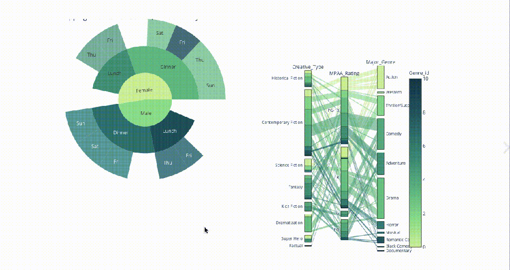
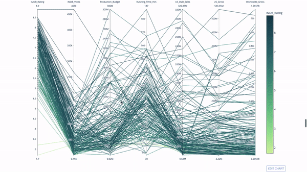
Imagine you’ve covered what you thought was important for your presentation and then get follow-up questions from your audience that refer to minor details or a certain subgroup of your population. Now, you have to go back to your code to retrieve an answer or follow up on that later. Wouldn’t it be way easier to just slice up your plot and retrieve whatever needed right on spot? Check out, for example, this parallel coordinates plot that you can filter and highlight on any variable:
Or, this animated bar chart that you can interact with as you present:

What is needed to get started?
- A Plotly chart studio account: you can easily sign up with your github, Google or Facebook accounts.
- Interactive Plotly plots: in my last post, I introduced Plotly’s interactive plots and animations. The code available in the post should be enough to generate a few plots to play with.
- Finally, a quick download of the Spectacle editor.
Diving in
Once you’ve logged in, the interface is very familiar and intuitive to work with. Start up with your usual presentation prep routine:
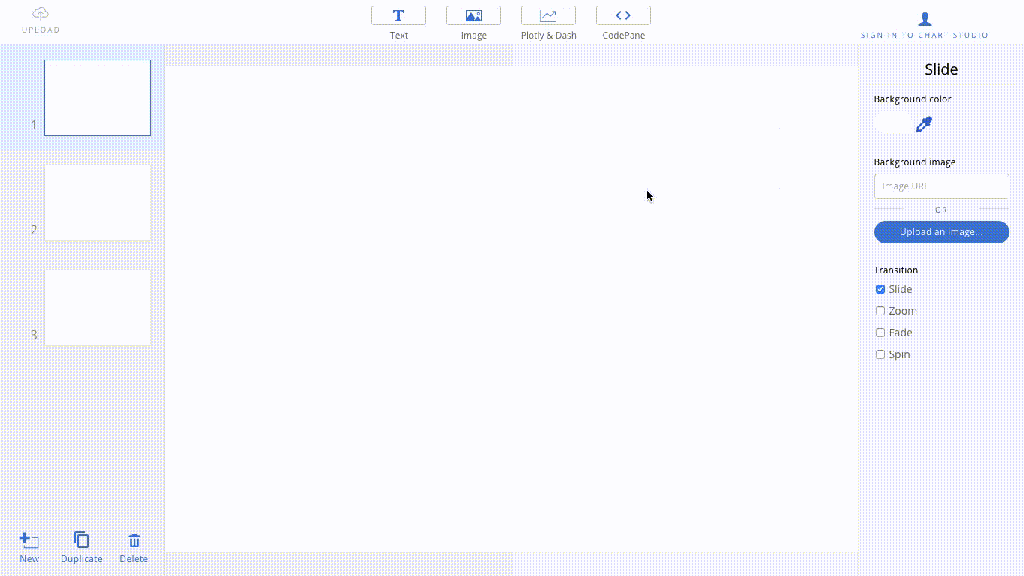
When it comes to the interactive plots, you just need to:
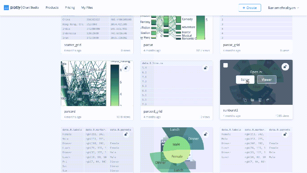
1. Publish your plot on Chart Studio and copy your plot’s url
2. Go back to Spectacle, click on ‘’Plotly and Dash’’ and paste the url:
3. The plot should be instantly integrated in your slides. It will become interactive once you’re in the presentation mode (cmd+L).
In addition, you can nicely integrate and share source code of any language in your slides. Just click on CodePane, choose your language and paste your code:

Once you’re done, hit cmd+Lto present your work, slice through your plots and make the most out of your visualisation skills. You can also save a .pdf version of your presentation, if needed.
Next time, your audience wants to know more, you’re ready to manipulate your data right on spot and quickly resolve any doubts!
Further reading:
For more information on the editor, check Plotly’s official documentation.
For more interactive visualisations, you can have a look at my post “5 Visualisations to Level Up Your Data Story”.
That’s about it!
I hope you found this useful and will add it to your toolbox. Stay safe and stay productive!
