
From: https://medium.com/plotly/interactive-and-scalable-dashboards-with-vaex-and-dash-9b104b2dc9f0
The thing about dashboards…
Creating dashboards is often an integral part of data science projects. Dashboards are all about communication: be it sharing the findings of data science teams with the executives, monitoring key business metrics, or tracking the performance of a model in production. Most importantly, a good dashboard should present meaningful data in a way that leads to actionable insights, thus creating value for the organization.
Just use Dash!
Dash is a Python Open Source library for creating Web-based applications.
Built on top of React.js, Plotly.js and Flask, it is ideal for rapidly developing
high quality, production ready interactive dashboards. The Python API neatly wraps a variety of React.js components, which can be pieced together with various Plotly.js visualisations to create stunning web applications. This can be a powerful tool for data scientists, enabling them to clearly and efficiently convey the story of their data without needing to be experts in front-end technologies or web development.
What about… bigger datasets?
An increasingly common challenge nowadays comes from the fact that for many organisations, the sheer amount of data is becoming overwhelming to handle (e.g. in the range of a few million to a few billion samples). Data scientists often struggle to work with such “uncomfortably large datasets”, as the majority of the standard tools have not been designed with such scale in mind. The challenge becomes even more pronounced when one attempts to build an interactive dashboard that is expected to manipulate large quantities of data on-the-fly.
To overcome this challenge, data scientists can use Vaex, an Open Source DataFrame library in Python, specifically designed from the ground up to work with data as large as the size of a hard-drive. It uses memory mapping, meaning that not all of it needs to fit in RAM at one time. Memory mapping also allows the same physical memory to be shared amongst all processes. This is quite useful for Dash, which uses workers to scale vertically and Kubernetes to scale horizontally. In addition, Vaex implements efficient, fully parallelized out-of-core algorithms that make you forget you were working with a large dataset to begin with. The API closely follows the foundation set by Pandas, so one can feel right at home using it.
How fast is Vaex really?
In this article, Jonathan Alexander uses a 1,000,000,000+ (yes over a billion!) row dataset to compare the performance of Vaex, PySpark, Dask DataFrame and other libraries commonly used for manipulating very large datasets — on a single machine. He found Vaex to be consistently faster, sometimes over 500 times faster, compared to the competition.
Another important advantage when using Vaex is that you do not need to set up or manage a cluster. Just run pip install vaex, and you are good to go.
Dash & Vaex
Vaex is the prefect companion to Dash for building simple, and yet powerful interactive analytical dashboards or web application. Applications built with Dash are reactive. When a user pushes a button or moves a slider for example, one or more callbacks are triggered on the server, which executes the computations needed to update the application. The server itself is stateless, so it keeps no memory of any interaction with the user. This allows Dash to scale both vertically (adding more workers) and horizontally (adding more nodes). In some ways, Vaex has a similar relationship with its data. The data lives on disk and is immutable. Vaex is fast enough to be stateless as well, meaning that filtering and aggregations can be done for each requestwithout modifying or copying the data. The results of any computations or group-by aggregations are sufficiently small to be used as a basis for visualisations since they will need to be sent to the browser.
In addition, Vaex is fast enough to handle each request on a single node or worker, avoiding the need to set-up a cluster. Other tools that are commonly used to tackle larger datasets attempt to do so via distributed computing. While this is a valid approach, it comes with a significant overhead to infrastructure management, cost, and set-up.
In this article, we will show how anyone can create a fully interactive web application built around a dataset that barely fits into RAM on most machines (12 GB). We will use Vaex for all of the data manipulation, aggregation and statistic computations, which will then be visualized, and made interactive via Plotly and Dash.
To learn more about the basics of Dash, please read through the tutorial in the documentation. The Vaex documentation pages also contain a comprehensive tutorial and a number of examples.
Let’s get started
The public availability, relatability and size has made the New York Taxi dataset the de facto standard for benchmarking and showcasing various approaches to manipulating large datasets. The following example uses a full year of the YellowCab Taxi company data from their prime, numbering well over 100 million trips. We used Plotly, Dash and Vaex in combination with the taxi data to build an interactive web application that informs prospective passengers of the likely cost and duration of their next trip, while at the same time giving insights to the taxi company managers of some general trends.
Try it out LIVE!
If the curiosity is getting the better of you, follow this linkto try out the application! The full code is available on GitHub. If you are interested in how the data was prepared, and how to obtain it for yourself, please read though this notebook.

A simple but informative example
To give an idea of how you too can build a snappy dashboard using data that barely fits in memory with Dash and Vaex, let us work through an example that highlights the main points.
We are going to use the taxi data to build a “Trip planner”. This will consist of a fully interactive heatmap which will show the number of taxi pick-up locations across New York City. By interactive, we mean that the user should be able to pan and zoom. After each action, the map should be recomputed given the updated view, instead of “just making the pixels bigger”. The user should be able to define a custom point of origin and destination by clicking on the map, and as a result get some informative visualizations regarding the potential trips and some statistics such as expected cost and duration. The users should be able to further select a specific day or hour range to get better insights about their trip. At the end, it should look something like this:

In what follows, we are going to assume a reasonable familiarity with Dash and will not expose all of the nitty-gritty details, but rather discuss the most important concepts.
Let us start by importing the relevant libraries and load the data:
import os
import dash
from dash.dependencies import Input, Output, State
import dash_core_components as dcc
import dash_html_components as html
import plotly.graph_objs as go
import plotly.express as px
from flask_caching import Cache
import numpy as np
import vaex


# Load the data
df_original = vaex.open('/data/taxi/yellow_taxi_2012_zones.hdf5')
Note that the size of the data file does not matter. Vaex will memory-map the data instantly and will read in the specifically requested portions of it only when necessary. Also, as is often the case with Dash, if multiple workers are running, each of them will share the same physical memory of the memory-mapped file — fast and efficient!
Vaex will memory-map the data instantly and will read in the specifically requested portions of it only when necessary. Also, as is often the case with Dash, if multiple workers are running, each of them will share the same physical memory of the memory-mapped file — fast and efficient!
The next step is to set up the Dash application with a simple layout. In our case, these are the main components to consider:
- The components part of the “control panel” that lets the user select trips based on time
dcc.Dropdown(id='days')and day of weekdcc.Dropdown(id='days'); - The interactive map
dcc.Graph(id='heatmap_figure'); - The resulting visualisations based on the user input, which will be the distributions of the trip costs and durations, and a markdown block showing some key statistics. The components are
dcc.Graph(id='trip_summary_amount_figure'),dcc.Graph(id='trip_summary_duration_figure'), anddcc.Markdown(id='trip_summary_md')respectably. - Several
dcc.Store()components that to track the state of the user at the client side. Remember, the Dash server itself is stateless.
app = dash.Dash(__name__)

# Set up the caching mechanism
cache = Cache(app.server, config={
    'CACHE_TYPE': 'filesystem',
    'CACHE_DIR': 'cache-directory'
})
# set negative to disable (useful for testing/benchmarking)
CACHE_TIMEOUT = int(os.environ.get('DASH_CACHE_TIMEOUT', '60'))

app.layout = html.Div(className='app-body', children=[
    # Stores
    dcc.Store(id='map_clicks', data=0),
    dcc.Store(id='trip_start', data=trip_start_initial),
    dcc.Store(id='trip_end', data=trip_end_initial),
    dcc.Store(id='heatmap_limits', data=heatmap_limits_initial),
    # Control panel
    html.Div(className="row", id='control-panel', children=[
        html.Div(className="four columns pretty_container", children=[
            html.Label('Select pick-up hours'),
            dcc.RangeSlider(id='hours',
                            value=[0, 23],
                            min=0, max=23,
                            marks={i: str(i) for i in range(0, 24, 3)})
        ]),
        html.Div(className="four columns pretty_container", children=[
            html.Label('Select pick-up days'),
            dcc.Dropdown(id='days',
                         placeholder='Select a day of week',
                         options=[{'label': 'Monday', 'value': 0},
                                  {'label': 'Tuesday', 'value': 1},
                                  {'label': 'Wednesday', 'value': 2},
                                  {'label': 'Thursday', 'value': 3},
                                  {'label': 'Friday', 'value': 4},
                                  {'label': 'Saturday', 'value': 5},
                                  {'label': 'Sunday', 'value': 6}],
                         value=[],
                         multi=True),
        ]),
    ]),

    # Visuals
    html.Div(className="row", children=[
             html.Div(className="seven columns pretty_container", children=[
                dcc.Markdown(children='_Click on the map to select trip start and destination._'),
                dcc.Graph(id='heatmap_figure',
                          figure=create_figure_heatmap(heatmap_data_initial,
                                                       heatmap_limits_initial,
                                                       trip_start_initial,
                                                       trip_end_initial))
             ]),
             html.Div(className="five columns pretty_container", children=[
                dcc.Graph(id='trip_summary_amount_figure'),
                dcc.Graph(id='trip_summary_duration_figure'),
                dcc.Markdown(id='trip_summary_md')
             ]),
    ]),
])
Now let’s talk about how to make everything work. We organize our functions in three groups:
- Functions that calculate the relevant aggregations and statistics, which are the basis for the visualisations. We prefix these with
compute_; - Functions that given those aggregation make the visualisation that are shown on the dashboard. We prefix these with
create_figure_; - Dash callback functions, which are decorated by the well known Dash callback decorator. They respond to changes from the user, call the compute function, and pass their outputs to the figure creation functions.
We find that separating the functions into these three groups makes it easier to organize the functionality of the dashboard. Also, it allows us to pre-populate the application, avoiding callback triggering on the initial page load (a new feature in Dash v1.1!). Yes, we’re going to squeeze every bit of performance out of this app!
Let’s start by computing the heatmap. The initial step is selecting the relevant subset of the data the user may have specified via the Range Slider and Dropdown elements that control the pick-up hour and day of week respectively:
def create_selection(days, hours):
    df = df_original.copy()
    selection = None
    if hours:
        hour_min, hour_max = hours
        if hour_min > 0:
            df.select((hour_min <= df.pickup_hour), mode='and')
            selection = True
        if hour_max < 23:
            df.select((df.pickup_hour <= hour_max), mode='and')
            selection = True
    if (len(days) > 0) & (len(days) < 7):
        df.select(df.pickup_day.isin(days), mode='and')
        selection = True
    return df, selection
In the above code-block, we first make a shallow copy of the DataFrame, since we are going to use selections, which are stateful object in the DataFrame. Since Dash is multi-threaded, we do not want users to affect each others selections. (Note: we could also use filtering e.g. ddf = df[df.foo > 0], but Vaex treats selections a bit differently from filters, giving us another performance boost). The selection itself tells Vaex which parts of the DataFrame should be used for any computation, and was created based on the choices of the user.
We are now ready to compute the heatmap data:
@cache.memoize(timeout=CACHE_TIMEOUT)
def compute_heatmap_data(days, hours, heatmap_limits):
    df, selection = create_selection(days, hours)
    heatmap_data_array = df.count(binby=[df.pickup_longitude,
                                         df.pickup_latitude],
                                  selection=selection,
                                  limits=heatmap_limits,
                                  shape=256,
                                  array_type="xarray")
    return heatmap_data_array
All Vaex DataFrame methods, such as .count(), are fully parallelized and out-of-core, and can be applied regardless of the size of your data. To compute the heatmap data, we pass the two relevant columns via the binby argument to the .count() method. With this, we count the number of samples in a grid specified by those axes. The grid is further specified by its shape (i.e. the number of bins per axis) and limits (or extent). Also notice the array_type="xarray" argument of .count(). With this we specify that the output should be an xarray data array, which is basically a numpy array where each dimension is labelled. This can be quite convenient for plotting, as we will soon see. Keep an eye on that decorator as well. We will explain its purpose over the next few paragraphs.
Now that we have the heatmap data computed, we are ready to create the figure which will be displayed on the dashboard.
def create_figure_heatmap(data_array, heatmap_limits, trip_start, trip_end):
    # Set up the layout of the figure
    legend = go.layout.Legend(orientation='h',
                              x=0.0,
                              y=-0.05,
                              font={'color': 'azure'},
                              bgcolor='royalblue',
                              itemclick=False,
                              itemdoubleclick=False)
    margin = go.layout.Margin(l=0, r=0, b=0, t=30)
    # if we don't explicitly set the width, we get a lot of autoresize events
    layout = go.Layout(height=600,
                       title=None,
                       margin=margin,
                       legend=legend,
                       xaxis=go.layout.XAxis(title='Longitude', range=heatmap_limits[0]),
                       yaxis=go.layout.YAxis(title='Latitude', range=heatmap_limits[1]),
                       **fig_layout_defaults)

    # add the heatmap
    # Use plotly express in combination with xarray - easy plotting!
    fig = px.imshow(np.log1p(data_array.T), origin='lower')
    fig.layout = layout

    # add markers for the points clicked
    def add_point(x, y, **kwargs):
        fig.add_trace(go.Scatter(x=[x], y=[y], marker_color='azure', marker_size=8, mode='markers', showlegend=True, **kwargs))

    if trip_start:
        add_point(trip_start[0], trip_start[1], name='Trip start', marker_symbol='circle')

    if trip_end:
        add_point(trip_end[0], trip_end[1], name='Trip end', marker_symbol='x')

    return fig
In the function above, we use Plotly Express to create an actual heatmap using the data we just computed. If trip_start and trip_end coordinates are given, they will be added to the figure as individual plotly.graph_objs.Scatter traces.
The Plotly figures are interactive by nature. They are already created in such a way that they can readily capture events such as zooming, panning and clicking.
Now let’s set up a primary Dash callback that will update the heatmap figure based on any changes in the data selection or changes to the map view:
@app.callback(Output('heatmap_figure', 'figure'),
              [Input('days', 'value'),
               Input('hours', 'value'),
               Input('heatmap_limits', 'data'),
               Input('trip_start', 'data'),
               Input('trip_end', 'data')],
              prevent_initial_call=True)
def update_heatmap_figure(days, hours, heatmap_limits, trip_start, trip_end):
    data_array = compute_heatmap_data(days, hours, heatmap_limits)
    return create_figure_heatmap(data_array, heatmap_limits, trip_start, trip_end)
In the above code-block, we define a function which will be triggered if any of the Input values is changed. The function itself will then call compute_heatmap_data, which will compute a new aggregation, given the new input parameters and use that result to create a new heatmap figure. Setting the prevent_initial_call argument of the decorator prevents this function to be called when the dashboard is first started.
Notice how the compute_heatmap_data is called when the update_heatmap_figure is triggered when trip_start or trip_end change, even though they are not parameters of compute_heatmap_data. Avoiding such needless calls is the exact purpose of the decorator attached to compute_heatmap_data. While there are several way to avoid this (we explored many), we finally settled on using the flask_caching library, as recommended by Plotly, to cache old computations for 60 seconds — fast, easy, and simple.
To capture user interactions with the heatmap, such as panning and zooming, we define the following Dash callback:
@app.callback(
    Output('heatmap_limits', 'data'),
    [Input('heatmap_figure', 'relayoutData')],
    [State('heatmap_limits', 'data')],
    prevent_initial_call=True)
def update_limits(relayoutData, heatmap_limits):
    if relayoutData is None:
        raise dash.exceptions.PreventUpdate
    elif relayoutData is not None and 'xaxis.range[0]' in relayoutData:
        d = relayoutData
        heatmap_limits = [[d['xaxis.range[0]'], d['xaxis.range[1]']], [d['yaxis.range[0]'], d['yaxis.range[1]']]]
    else:
        raise dash.exceptions.PreventUpdate
        if heatmap_limits is None:
            heatmap_limits = heatmap_limits_initial
    return heatmap_limits
Capturing and responding to click events is handled by the this Dash callback:
@app.callback([Output('map_clicks', 'data'),
               Output('trip_start', 'data'),
               Output('trip_end', 'data')],
              [Input('heatmap_figure', 'clickData')],
              [State('map_clicks', 'data'),
               State('trip_start', 'data'),
               State('trip_end', 'data')],
              prevent_initial_call=True)
def click_heatmap_action(click_data_heatmap, map_clicks, trip_start, trip_end):
    if click_data_heatmap is not None:
        point = click_data_heatmap['points'][0]['x'], click_data_heatmap['points'][0]['y']
        new_location = point[0], point[1]
        # the 1st and 3rd and 5th click change the start point
        if map_clicks % 2 == 0:
            trip_start = new_location
            trip_end = None  # and reset the end point
        else:
            # the 2nd, 4th etc set the end point
            trip_end = new_location
        map_clicks += 1
    return map_clicks, trip_start, trip_end
Note that both of the above callback functions update key components needed to create the heatmap itself. Thus, whenever a click or relay (pan or zoom) event is detected, updating the key components will trigger the update_heatmap_figure callback, which in turn will update the heatmap figure. With the above function we create a fully interactive heatmap figure, which can be updated using external controls (the RangeSlider and Dropdown menu), as well as by interacting with the figure itself.
Note that due to the nature of Dash application — stateless, reactive, and functional — we just write functions that create the visualisations. We do not need to write distinct functions to create and functions to update those visualisations, saving not only lines of code, but also protecting against bugs.
Now, we want to show some results, given the user input. We will use the click events to select trips starting from the “origin” and ending at the “destination” point. For those trips, we will create and display the distribution of cost and duration, and highlight the most likely values for both.
We can compute all of that in a single function:
@cache.memoize(timeout=CACHE_TIMEOUT)
def compute_trip_details(days, hours, trip_start, trip_end):
    # Apply the selection to the dataframe
    df, selection = create_selection(days, hours)

    # Radius around which to select trips
    # One mile is ~0.0145 deg; and in NYC there are approx 20 blocks per mile
    # We will select a radius of 3 blocks
    r = 0.0145 / 20 * 3
    pickup_long, pickup_lat = trip_start
    dropoff_long, dropoff_lat = trip_end

    selection_pickup = (df.pickup_longitude - pickup_long)**2 + (df.pickup_latitude - pickup_lat)**2 <= r**2
    selection_dropoff = (df.dropoff_longitude - dropoff_long)**2 + (df.dropoff_latitude - dropoff_lat)**2 <= r**2
    df.select(selection_pickup & selection_dropoff, mode='and')
    selection = True  # after this the selection is always True

    return {'counts': df.count(selection=selection),
            'counts_total': df.count(binby=[df.total_amount], limits=[0, 50], shape=25, selection=selection),
            'counts_duration': df.count(binby=[df.trip_duration_min], limits=[0, 50], shape=25, selection=selection)
            }
Let us define a helper function to create a histogram figure given already aggregated data:
def create_figure_histogram(x, counts, title=None, xlabel=None, ylabel=None):
    # settings
    color = 'royalblue'

    # list of traces
    traces = []

    # Create the figure
    line = go.scatter.Line(color=color, width=2)
    hist = go.Scatter(x=x, y=counts,
                      mode='lines', line_shape='hv', line=line,
                      name=title, fill='tozerox')
    traces.append(hist)

    # Layout
    title = go.layout.Title(text=title, x=0.5, y=1, font={'color': 'black'})
    margin = go.layout.Margin(l=0, r=0, b=0, t=30)
    legend = go.layout.Legend(orientation='h',
                              bgcolor='rgba(0,0,0,0)',
                              x=0.5,
                              y=1,
                              itemclick=False,
                              itemdoubleclick=False)
    layout = go.Layout(height=230,
                       margin=margin,
                       legend=legend,
                       title=title,
                       xaxis=go.layout.XAxis(title=xlabel),
                       yaxis=go.layout.YAxis(title=ylabel),
                       **fig_layout_defaults)

    # Now calculate the most likely value (peak of the histogram)
    peak = np.round(x[np.argmax(counts)], 2)

    return go.FigureWidget(data=traces, layout=layout), peak


def make_empty_plot():
    layout = go.Layout(plot_bgcolor='white', width=10, height=10,
                       xaxis=go.layout.XAxis(visible=False),
                       yaxis=go.layout.YAxis(visible=False))
    return go.FigureWidget(layout=layout)
Now that we have all the components ready, it is time to link them to the Dash application via a callback function:
@app.callback([Output('trip_summary_amount_figure', 'figure'),
               Output('trip_summary_duration_figure', 'figure'),
               Output('trip_summary_md', 'children')],
              [Input('days', 'value'),
               Input('hours', 'value'),
               Input('trip_start', 'data'),
               Input('trip_end', 'data')]
              )
def trip_details_summary(days, hours, trip_start, trip_end):
    if trip_start is None or trip_end is None:
        fig_empty = make_empty_plot()
        if trip_start is None:
            text = '''Please select a start location on the map.'''
        else:
            text = '''Please select a destination location on the map.'''
        return fig_empty, fig_empty, text

    trip_detail_data = compute_trip_details(days, hours, trip_start, trip_end)

    counts = trip_detail_data['counts']
    counts_total = np.array(trip_detail_data['counts_total'])
    counts_duration = np.array(trip_detail_data['counts_duration'])
    fig_amount, peak_amount = create_figure_histogram(df_original.bin_edges(df_original.total_amount, [0, 50], shape=25),
                                                      counts_total,
                                                      title=None,
                                                      xlabel='Total amount [$]',
                                                      ylabel='Numbe or rides')
    # The trip duration
    fig_duration, peak_duration = create_figure_histogram(df_original.bin_edges(df_original.trip_duration_min, [0, 50], shape=25),
                                                          counts_duration,
                                                          title=None,
                                                          xlabel='Trip duration [min]',
                                                          ylabel='Numbe or rides')

    trip_stats = f'''
                    **Trip statistics:**
                    - Number of rides: {counts}
                    - Most likely trip total cost: ${peak_amount}
                    - Most likely trip duration: {peak_duration} minutes
                    '''

    return fig_amount, fig_duration, trip_stats
The above callback function “listens” to any changes in the “control panel”, as well as any new clicks on the heatmap which would define new origin or destination points. When a relevant event is registered, the function is triggered and will in turn call the compute_trip_details and create_histogram_figure functions with the new parameters, thus updating the visualisations.
There is one subtlety here: a user may click once to select a new starting point, but then the new destination is not yet defined. In this case we simply “blank out” the histogram figures with the following function:
def create_figure_empty():
    layout = go.Layout(plot_bgcolor='white', width=10, height=10,
                       xaxis=go.layout.XAxis(visible=False),
                       yaxis=go.layout.YAxis(visible=False))
    return go.FigureWidget(layout=layout)
Finally, to be able to run the dashboard, the source file should conclude with:
if __name__ == '__main__':
    app.run_server(debug=True)
And there we have it: a simple yet powerful interactive Dash application! To run it locally execute the python app.py command in your terminal, provided that you have named your source file as “app.py”, and you have the taxi data at hand. You can also review the entire source file via this GitHub Gist.
Something different
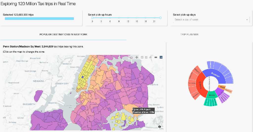
Plotly implements a variety of creative ways to visualise one’s data. To show something other than the typical heatmaps and histograms, our complete dashboard also contains several informative, but less common way to visualise aggregated data. On the first tab, you can see a geographical map on which the NYC zones are coloured relative to the number of taxi pick-ups. A user can than select a zone on the map and get information on popular destinations (zones and boroughs) via the Sankey and Sunburst diagrams. The user can also click on a zone on these diagrams to get the most popular destinations of that zone. Creating this functionality follows the same design principles as for the Trip planner tab that we discussed above. The core of it revolves around groupby operations followed by some manipulations to get the data into the format Plotly requires. It’s fast and beautiful! If you are interested in the details, you can see the code here.
Performance
You may wonder, how many users can our full dashboard serve at the same time? This depends a bit on what the users do of course, but we can give some numbers to get an idea of the performance. When changing the zone on the geographical map (the choroplethmapbox) and no hours or days are selected, we can run 40 computations (requests) per second, or 3.5 million requests per day. The most expensive operations happen when interacting with the Trip Planner heatmap with hours and days selections. In this case, we are able to serve 10 requests per second, or 0.8 million requests per day.
How this translates to a concurrent number of users depends very much on their behaviour, but serving 10–20 concurrent users should not be a problem. Assuming the users stay around for a minute and interact with the dashboard every second, this would translate to 14–28k sessions per day exploring over 120 million rows on a single machine! Not only cost-effective, but also environmentally friendly.
All these benchmarks are run on an AMD 3970X (32 cores) desktop machine.
Scaling: More users
Do you want to serve more users? Because Dash is stateless at the server-side, it is easy to scale up by adding more computers/nodes (scaling horizontally). Any DevOps engineer should be able to add a load balancer in front of a farm of Dash servers. Alternatively, one can use Dash Enterprise Kubernetes autoscaling feature which will automatically scale up or scale down your compute according to the usage. New nodes should spin up rapidly since they only require to have access to the dataset. Starting the server itself takes about a second due to the memory mapping.
Scaling: More data
What about dashboards showing even larger data? Vaex can easily handle datasets comprised of billions of rows! To show this capability, we can also serve the above dashboard with a larger version of the NYC taxi dataset that numbers over half a billion trips. Due to computation cost however, we do not share this version of the app publicly. If you are interested in trying this out, please contact either Plotly or Vaex.
Let your data talk. All of it.
The combination of Dash and Vaex empowers data scientists to easily create scalable, production ready web applications utilising rather large datasets that otherwise can not fit into memory. With the scalability of Dash, and the superb performance of Vaex, you can let your data tell the full story — to everyone.
Thanks to Maarten Breddels, plotly, and Nicolas Kruchten.
